What is Responsive design and How to implement ?
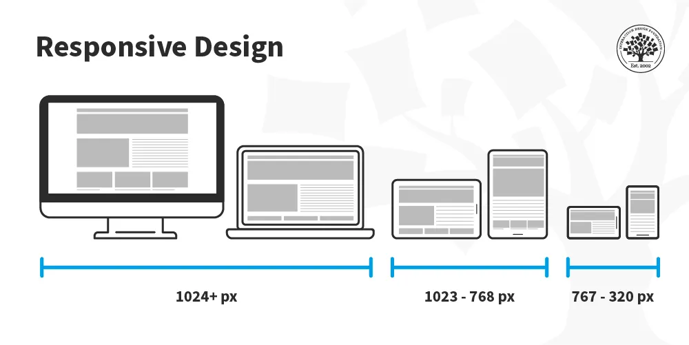
Responsive Design
Responsive design is an approach to web design in which the interface adapts to the device's layout, facilitating usability, navigation and information seeking.
Break Point ?
Each breakpoint (a key) matches with a fixed screen width (a value) :
- xs, extra-small: 0px
- sm, small: 600px
- md, medium: 900px
- lg, large: 1200px
- xl, extra-large: 1536px
for the simple the break point is like you have created the rule (if-else) that you can display the website, webpage in the different layout.
you can handle to display with many other devices eg. mobile, monitor, tablet
the breakpoint very important concept in the responsive development.
What is Container ?
if you have some ultra wide screen monitor , how to manage the layout with these device
the problem is this device will render the whole of content of your webpage for example I will use the use case of facebook webpage
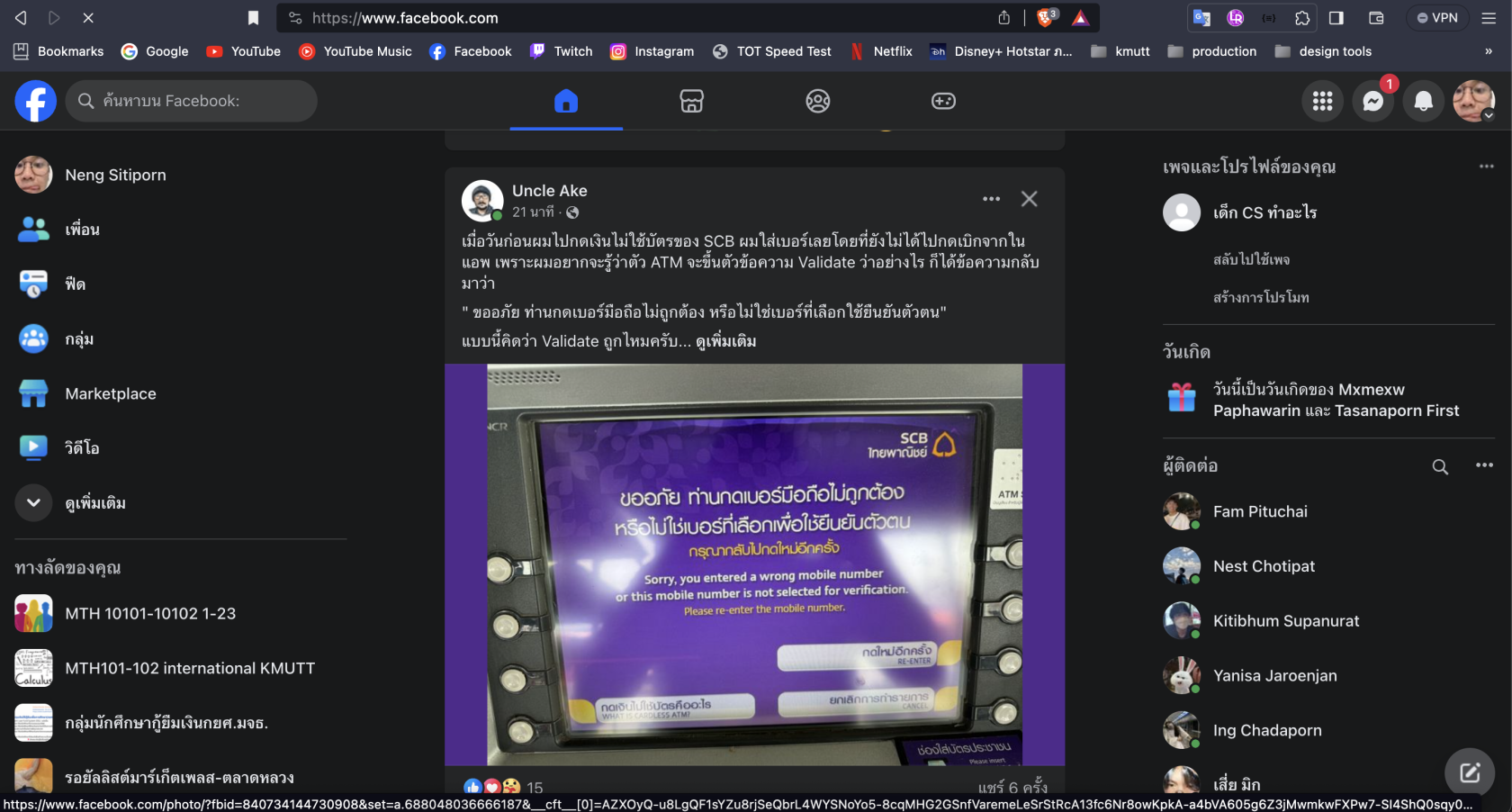
this is facebook render in the normal screen (not wide screen)
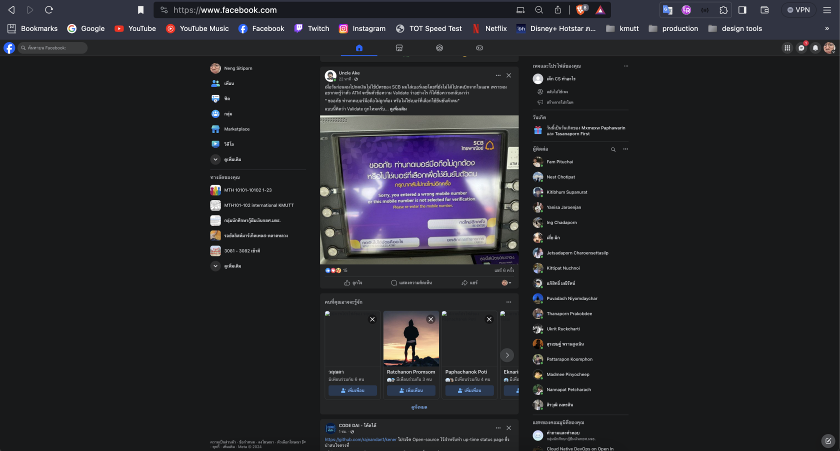
this is facebook webpage render in wide screen
Do you find the different of these images ?
in the second image they have a container component cover of whole content. (center component)
this is where the container come in and benefit of it to help developer to support the wide screen or in the other ways.


