Introduce Flex box / Grid Layout Systems
Flex Box
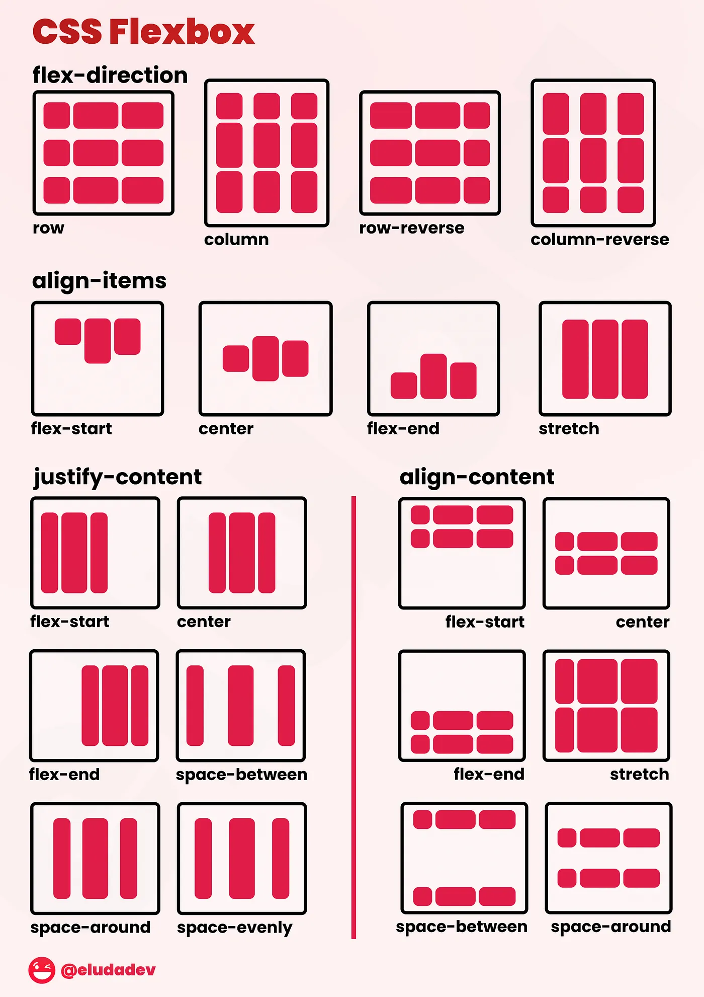
What is Flexbox?
Flexbox is a layout model that allows you to distribute space and align elements within a container, even when the sizes of the elements are unknown or dynamic. Unlike traditional layout models, such as floats and positioning, Flexbox provides a more predictable and maintainable way to arrange elements in a container, making it ideal for building complex interfaces.
Basic grid
Column widths are integer values between 1 and 12; they apply at any breakpoint and indicate how many columns are occupied by the component.
A value passed to any given breakpoint also applies to all wider breakpoints (if they have no values explicitly defined). For example, xs={12} sizes a component to occupy the full width of its parent container, regardless of the viewport size.
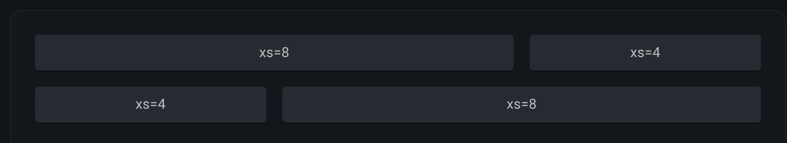
<Grid container spacing={2}>
  <Grid item xs={8}>
    <Item>xs=8</Item>
  </Grid>
  <Grid item xs={4}>
    <Item>xs=4</Item>
  </Grid>
  <Grid item xs={4}>
    <Item>xs=4</Item>
  </Grid>
  <Grid item xs={8}>
    <Item>xs=8</Item>
  </Grid>
</Grid>
Code of Grid systems with MUI Library
No comments to display
No comments to display