Bank App Home Page
Throughout this course we will try to create full stack bank app web application that fully functioning
Creating Home Page
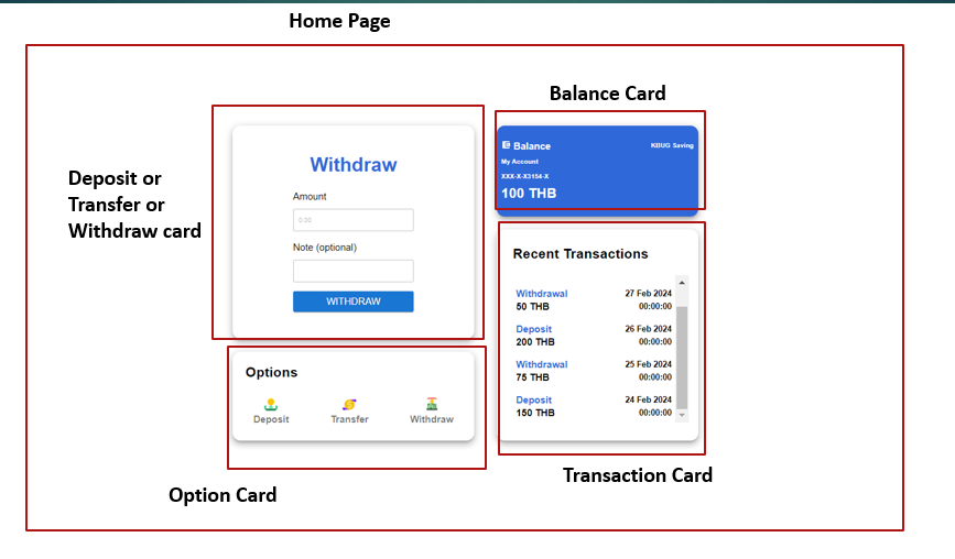
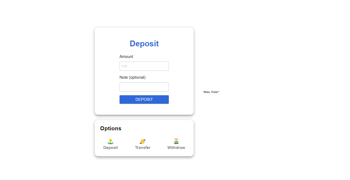
The final result of this lab should look like this
The home page should consist of
- Deposit/transfer/ withdraw card : originally it's 3 components but it will change whenever we click the logo on option card. The card show the type of transaction that we choose between deposit, transfer or withdraw
- Option Card: Card that consist of 3 logo that act as a button to click which have a function of choosing type of transaction that will trigger the card above it
- Balance Card: Card to show the account balance
- Transaction Card: Card to show the list of transaction history
Setup the Project
1. Follow the previous lesson about how to create or start a react project or you can click here to navigate
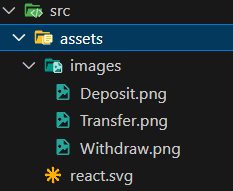
2. On the src folder inside the assets folder create images folder . After that, download the images from this link and insert to the images folder
https://drive.google.com/drive/folders/1iTWmtOYd86Y1d9RxAEM2-qgSQyT-toQi?usp=drive_link
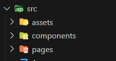
3. Inside the src folder create pages folder for storing pages in our frontend also components folder to store our components of each pages
4. Inside the pages folder create Homepage.jsx file
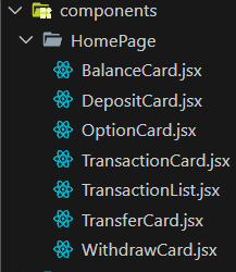
5. Inside the components folder create another folder called HomePage and inside the HomePage folder create files exactly like shown in the picture
6. Replace the code inside the App.jsx with the code below
import Homepage from './pages/Homepage';

function App() {
  return (
    <div className="App"  style={{ display: 'flex', justifyContent: 'center', alignItems: 'center', minHeight: '100vh' }}>
      <Homepage />
    </div>
  );
}
export default App;
and also replace the index.css with provided code below
body {
  margin: 0;
  font-family: Roboto;
  height: 100%
}

code {
  font-family: source-code-pro, Menlo, Monaco, Consolas, 'Courier New',
    monospace;
}

.App{
  height: 100vh;
}
7. Then we're gonna install some dependencies that will help us in the front end. In you terminal of current project type the command below
npm i @emotion/react @emotion/styled @mui/material @mui/icons-material@emotion/react: Provides utilities for using Emotion CSS-in-JS with React.
@emotion/styled: Allows creating styled components using Emotion CSS-in-JS.
@mui/material: Core Material-UI library for ready-to-use React components styled according to Material Design.
@mui/icons-material: Collection of Material-UI icons for use in React applications.
8. Try to insert the code below inside the Homepage.jsx and try to run the project
import React, { useState } from "react";
import { Box } from "@mui/material";

function Homepage() {
  return (
    <>
      <Box
        sx={{
          width: { md: 600, xs: "90%" },
          display: "flex",
          justifyContent: "start",
          alignItems: "start",
          flexDirection: "column",
          gap: 4,
          p: { md: 0, xs: 2 },
          margin: 7,
        }}
      >
        <h1>Homepage</h1>
      </Box>

      <Box
        sx={{
          width: { md: 600, xs: "90%" },
          display: "flex",
          justifyContent: "start",
          alignItems: "start",
          flexDirection: "column",
          gap: 4,
          p: { md: 0, xs: 2 },
        }}
      >
        "Hello, World!"
      </Box>
    </>
  );
}

export default Homepage;
Currently it show only text, but in the future step we will create each components
Deposit or Transfer or Withdraw Component and Option Component
1. Inside the DepositCard.jsx insert the code below
import { Button, Box, TextField, Typography } from "@mui/material"; // Importing necessary components from Material-UI
import { useState } from "react"; // Importing useState hook from React

function DepositCard({submit}){ // Defining a functional component named DepositCard which takes a prop named submit

    // State variables for transaction amount and note, initialized with default values
    const [transactionAmount, setTransactionAmount] = useState(0);
    const [transactionNote, setTransactionNote] = useState("");

    // Function to handle form submission
    const onSubmit = (amount, note) => {
        try{
            console.log(amount);
            console.log(note);
            // Calling the submit function passed as prop with transaction details
            submit(Number(amount), note);
            console.log('success');
        }
        catch(err){console.log(err)}
    }

    // Inline styling for body of the card
    const bodyStyle = {
        display: 'flex',
        width:'50%',
        height:530,
        flexDirection: 'column',
        alignItems:'center',
        justifyContent: 'center',
        gap:20,
    };

    // Inline styling for input fields
    const inputStyle = {
        display: 'flex',
        width:'100%',
        height:'20%',
        alignItems:'flex-start',
        flexDirection: 'column',
    };

    return <>
        {/* Outer Box component for styling */}
        <Box
            sx={{
                width: { md: 600, xs: "100%" },
                display: 'flex',
                justifyContent: 'center',
                borderRadius: 5,
                boxShadow: 10,
                mt:{ md: 0, xs: 10 }}}
        >

            {/* Inner Box component for body of the card */}
            <Box
                style={bodyStyle}>

                    {/* Typography component for title */}
                    <Typography
                        style={{fontWeight: 600,}}
                        sx={{
                            typography: { xs: 'h3' },
                            color:'#2F69D9',
                            mb:'5%'}}>
                            Deposit
                    </Typography>

                    {/* Box for amount input */}
                    <Box style={inputStyle}>

                        {/* Typography for amount label */}
                        <Typography
                            sx={{
                                mb:'5%',
                                typography: { md: 'h5', xs: 'subtitle1' },}}>
                            Amount
                        </Typography>

                        {/* TextField for amount input */}
                        <TextField
                            onChange={(e) => {
                                setTransactionAmount(e.target.value)
                                console.log(transactionAmount)}}
                            sx={{width:"100%"}}
                            type="number"
                            required
                            id="outlined-required"
                            placeholder="0.00"
                        />

                    </Box>

                    {/* Box for note input */}
                    <Box style={inputStyle}>

                        {/* Typography for note label */}
                        <Typography
                            variant="h5"
                            sx={{
                                mb:'5%',
                                typography: { md: 'h5', xs: 'subtitle1' },}}>
                            Note {"(optional)"}
                        </Typography>

                        {/* TextField for note input */}
                        <TextField
                            onChange={(e) => setTransactionNote(e.target.value)}
                            sx={{width:"100%"}}
                            id="outlined-required"
                        />

                    </Box>

                    {/* Button for form submission */}
                    <Button
                        onClick={() => onSubmit(transactionAmount,transactionNote)}
                        variant="contained"
                        sx={{width:"100%",height:50,backgroundColor:"#2F69D9"}}>
                        <Typography
                        sx={{
                            typography: { md: 'h5', xs: 'subtitle1' }}}>
                        Deposit
                        </Typography>
                    </Button>

            </Box>
        </Box>
    </>
}

export default DepositCard; // Exporting the DepositCard component as default
2. Box:
- The `Box` component is a versatile component that serves as a layout container. It can be used to create a variety of layout structures using flexbox or grid.
- It accepts various styling props to customize its appearance, such as `sx` for custom CSS styling.
- In the provided code, `Box` is used for grouping and styling the elements within the deposit card.
- Here's the documentation for the Box component: MUI-Box
3. TextField:
- The `TextField` component is used to create input fields for collecting user input.
- It supports various types of input, such as text, number, password, etc.
- It can be customized with props like `variant`, `placeholder`, `onChange`, etc.
- In the provided code, `TextField` components are used to collect the transaction amount and note.
- Here's the documentation for the TextField component: MUI-Text Fields
4. Typography:
- The `Typography` component is used to render text with predefined styles and variants.
- It allows customization of typography, such as font size, weight, color, etc.
- It supports various variants like `h1`, `h2`, `body1`, `subtitle1`, etc.
- In the provided code, `Typography` components are used for displaying titles, labels, and other textual content within the deposit card.
- Here's the documentation for the Typography component: MUI-Typography
2. Inside the TransferCard.jsx insert the code below
import { Button, Box, TextField, Typography } from "@mui/material"; // Importing necessary components from Material-UI
import { useState } from "react"; // Importing useState hook from React

function TransferCard({submit}) { // Defining a functional component named TransferCard which takes a prop named submit

  // State variables for transaction amount, note, and receiver, initialized with default values
  const [transactionAmount, setTransactionAmount] = useState(0);
  const [transactionNote, setTransactionNote] = useState("");
  const [transactionTo, setTransactionTo] = useState("");

  // Function to handle form submission
  const onSubmit = (amount, note, receiver) => {
    try {
      console.log(amount);
      console.log(note);
      console.log(receiver);
      // Calling the submit function passed as prop with transaction details
      submit(Number(amount), note, receiver);
      console.log('success');
    } catch(err) {
      console.log(err)
    }
  }

  // Inline styling for body of the card
  const bodyStyle = {
    display: "flex",
    width: "50%",
    height: 530,
    flexDirection: "column",
    alignItems: "center",
    justifyContent: "center",
    gap: 10,
  };

  // Inline styling for input fields
  const inputStyle = {
    display: "flex",
    width: "100%",
    height: "20%",
    alignItems: "flex-start",
    flexDirection: "column",
  };

  return (
    <>
      {/* Outer Box component for styling */}
      <Box
        sx={{
          width: { md: 600, xs: "100%" },
          display: "flex",
          justifyContent: "center",
          borderRadius: 5,
          boxShadow: 10,
          mt: { md: 0, xs: 10 },
        }}
      >
        {/* Inner Box component for body of the card */}
        <Box style={bodyStyle}>
          {/* Typography component for title */}
          <Typography
            style={{ fontWeight: 600 }}
            sx={{
              typography: { xs: "h3"},
              color: "#2F69D9",
              mb: "5%",
            }}
          >
            Transfer
          </Typography>

          {/* Box for amount input */}
          <Box style={inputStyle}>
            {/* Typography for amount label */}
            <Typography
              sx={{
                mb: "5%",
                typography: { md: "h5", xs: "subtitle1" },
              }}
            >
              Amount
            </Typography>

            {/* TextField for amount input */}
            <TextField
              onChange={(e) => {
                setTransactionAmount(e.target.value)
                console.log(transactionAmount)}}
              sx={{ width: "100%" }}
              type="number"
              required
              id="outlined-required"
              placeholder="0.00"
            />
          </Box>

          {/* Box for receiver input */}
          <Box style={inputStyle}>
            {/* Typography for receiver label */}
            <Typography
              sx={{
                mb: "5%",
                typography: { md: "h5", xs: "subtitle1" },
              }}
            >
              To
            </Typography>

            {/* TextField for receiver input */}
            <TextField
              onChange={(e) => {
                setTransactionTo(e.target.value)
                console.log(transactionTo)}}
              sx={{ width: "100%" }}
              required
              id="outlined-required"
            />
          </Box>

          {/* Box for note input */}
          <Box style={inputStyle}>
            {/* Typography for note label */}
            <Typography
              variant="h5"
              sx={{
                mb: "5%",
                typography: { md: "h5", xs: "subtitle1" },
              }}
            >
              Note {"(optional)"}
            </Typography>

            {/* TextField for note input */}
            <TextField
              onChange={(e) => setTransactionNote(e.target.value)}
              sx={{ width: "100%" }}
              id="outlined-required"
            />
          </Box>

          {/* Button for form submission */}
          <Button
            onClick={() => onSubmit(transactionAmount,transactionNote,transactionTo)}
            variant="contained"
            sx={{ width: "100%", height: 50 }}>
            {/* Typography for button label */}
            <Typography
              sx={{
                typography: { md: "h5", xs: "subtitle1" },
              }}
            >
              Transfer
            </Typography>
          </Button>
        </Box>
      </Box>
    </>
  );
}
export default TransferCard;
3. inside the WithdrawCard.jsx insert the code below
import { Button, Box, TextField, Typography } from "@mui/material"; // Importing necessary components from Material-UI
import { useState } from "react"; // Importing useState hook from React

function WithdrawCard({submit}) { // Defining a functional component named WithdrawCard which takes a prop named submit

  // State variables for transaction amount and note, initialized with default values
  const [transactionAmount, setTransactionAmount] = useState(0);
  const [transactionNote, setTransactionNote] = useState("");

  // Function to handle form submission
  const onSubmit = (amount, note) => {
    try {
      console.log(amount);
      console.log(note);
      // Calling the submit function passed as prop with transaction details
      submit(Number(amount), note);
      console.log('success');
    } catch(err) {
      console.log(err)
    }
  }

  // Inline styling for body of the card
  const bodyStyle = {
    display: "flex",
    width: "50%",
    height: 530,
    flexDirection: "column",
    alignItems: "center",
    justifyContent: "center",
    gap: 20,
  };

  // Inline styling for input fields
  const inputStyle = {
    display: "flex",
    width: "100%",
    height: "20%",
    alignItems: "flex-start",
    flexDirection: "column",
  };

  return (
    <>
      {/* Outer Box component for styling */}
      <Box
        sx={{
          width: { md: 600, xs: "100%" },
          display: "flex",
          justifyContent: "center",
          borderRadius: 5,
          boxShadow: 10,
          mt: { md: 0, xs: 10 },
        }}
      >
        {/* Inner Box component for body of the card */}
        <Box style={bodyStyle}>
          {/* Typography component for title */}
          <Typography
            style={{ fontWeight: 600 }}
            sx={{
              typography: { xs: "h3" },
              color: "#2F69D9",
              mb: "5%",
            }}
          >
            Withdraw
          </Typography>

          {/* Box for amount input */}
          <Box style={inputStyle}>
            {/* Typography for amount label */}
            <Typography
              sx={{
                mb: "5%",
                typography: { md: "h5", xs: "subtitle1" },
              }}
            >
              Amount
            </Typography>

            {/* TextField for amount input */}
            <TextField
              onChange={(e) => {
                setTransactionAmount(e.target.value)
                console.log(transactionAmount)}}
              sx={{ width: "100%" }}
              type="number"
              required
              id="outlined-required"
              placeholder="0.00"
            />
          </Box>

          {/* Box for note input */}
          <Box style={inputStyle}>
            {/* Typography for note label */}
            <Typography
              variant="h5"
              sx={{
                mb: "5%",
                typography: { md: "h5", xs: "subtitle1" },
              }}
            >
              Note {"(optional)"}
            </Typography>

            {/* TextField for note input */}
            <TextField
              onChange={(e) => setTransactionNote(e.target.value)}
              sx={{ width: "100%" }}
              id="outlined-required"
            />
          </Box>

          {/* Button for form submission */}
          <Button
            onClick={() => onSubmit(transactionAmount,transactionNote)}
            variant="contained"
            sx={{ width: "100%", height: 50 }}
            >
            {/* Typography for button label */}
            <Typography
              sx={{
                typography: { md: "h5", xs: "subtitle1" },
              }}
            >
              Withdraw
            </Typography>
          </Button>
        </Box>
      </Box>
    </>
  );
}
export default WithdrawCard;
4. Inside the OptionCard.jsx insert the code below. In this component we will import our image from assets folder
import * as React from 'react';
import { Box, Avatar, Typography, IconButton } from "@mui/material"; // Importing necessary components from Material-UI
import Deposit from "./../../assets/images/Deposit.png"; // Importing image for Deposit option
import Transfer from "./../../assets/images/Transfer.png"; // Importing image for Transfer option
import Withdraw from "./../../assets/images/Withdraw.png"; // Importing image for Withdraw option

function OptionCard({option}) { // Defining a functional component named OptionCard which takes a prop named option

  // Function to handle option click
  const onOptionClick = (x) => {
    option(x);
  }

  return (
    <>
      <React.Fragment>
        <Box
          sx={{
            width: { md: 600, xs: "100%" }, // Setting width based on screen size breakpoints
            borderRadius: 5, // Setting border radius
            boxShadow: 10, // Setting box shadow
          }}
        >
          <Box
            sx={{
              height: 220, // Setting fixed height
              display: "flex",
              flexDirection: "column",
              alignItems: "start",
              justifyContent: "center",
              gap: 4, // Setting gap between elements
            }}
          >
            {/* Typography for title */}
            <Typography variant="h4" style={{ fontWeight: 600 }} sx={{ pl: 4 }}>
              Options
            </Typography>

            <Box
              sx={{
                width: "100%",
                display: "flex",
                flexDirection: "row",
                justifyContent: "space-around",
              }}
            >
              {/* IconButton for Deposit option */}
              <IconButton onClick={() => onOptionClick('Deposit')} sx={{ borderRadius: 5 }}>
                <Box
                  sx={{
                    display: "flex",
                    flexDirection: "column",
                    alignItems: "center",
                  }}
                >
                  {/* Avatar for image */}
                  <Avatar src={Deposit} />
                  {/* Typography for Deposit label */}
                  <Typography variant="h5" style={{ fontWeight: 600 }}>
                    Deposit
                  </Typography>
                </Box>
              </IconButton>

              {/* Similar structure for Transfer and Withdraw options */}
              <IconButton onClick={() => onOptionClick('Transfer')} sx={{ borderRadius: 5 }}>
                <Box
                  sx={{
                    display: "flex",
                    flexDirection: "column",
                    alignItems: "center",
                  }}
                >
                  <Avatar src={Transfer} />
                  <Typography variant="h5" style={{ fontWeight: 600 }}>
                    Transfer
                  </Typography>
                </Box>
              </IconButton>

              <IconButton onClick={() => onOptionClick('Withdraw')} sx={{ borderRadius: 5 }}>
                <Box
                  sx={{
                    display: "flex",
                    flexDirection: "column",
                    alignItems: "center",
                  }}
                >
                  <Avatar src={Withdraw} />
                  <Typography variant="h5" style={{ fontWeight: 600 }}>
                    Withdraw
                  </Typography>
                </Box>
              </IconButton>
            </Box>
          </Box>
        </Box>
      </React.Fragment>
    </>
  );
}

export default OptionCard;
5. Finally inside the Homepage.jsx on the pages folder we will import the components that we have made so far. Replace the existing code with code below
import React, { useState } from "react"; // Importing React and useState hook
import { Box } from "@mui/material"; // Importing Box component from Material-UI
import DepositCard from "../components/HomePage/DepositCard"; // Importing DepositCard component
import OptionCard from "../components/HomePage/OptionCard"; // Importing OptionCard component
import WithdrawCard from "../components/HomePage/WithdrawCard"; // Importing WithdrawCard component
import TransferCard from "../components/HomePage/TransferCard"; // Importing TransferCard component

function Homepage() { // Defining a functional component named Homepage
  const [transactionType, setTransactionType] = useState("Deposit"); // State variable for transaction type, initialized with "Deposit"

  const onOptionChange = (type) => { // Function to handle option change
    setTransactionType(type); // Setting the transaction type based on the selected option
  };

  const [userData, setUserData] = useState({ balance: 100 }); // State variable for user data, simulating user balance

  const handleWithdraw = async (amount, note) => { // Function to handle withdrawal
    console.log("Withdraw:", amount, note); // Simulated handleWithdraw function
  };

  const handleTransfer = async (amount, note, receiver) => { // Function to handle transfer
    console.log("Transfer:", amount, note, receiver); // Simulated handleTransfer function
  };

  const handleDeposit = async (amount, note) => { // Function to handle deposit
    console.log("Deposit:", amount, note); // Simulated handleDeposit function
  };

  return (
    <>
      <Box
        sx={{
          width: { md: 600, xs: "90%" }, // Setting width based on screen size breakpoints
          display: "flex",
          justifyContent: "start",
          alignItems: "start",
          flexDirection: "column",
          gap: 4, // Setting gap between child components
          p: { md: 0, xs: 2 }, // Setting padding based on screen size breakpoints
          margin: 7, // Setting margin
        }}
      >
        {/* Rendering the appropriate card based on the transaction type */}
        {transactionType === "Deposit" ? (
          <DepositCard submit={handleDeposit} />
        ) : transactionType === "Withdraw" ? (
          <WithdrawCard submit={handleWithdraw} />
        ) : transactionType === "Transfer" ? (
          <TransferCard submit={handleTransfer} />
        ) : (
          <DepositCard submit={handleDeposit} /> // Defaulting to DepositCard
        )}

        <OptionCard option={onOptionChange} /> {/* Rendering the OptionCard component */}
      </Box>

      {/* Additional Box component */}
      <Box
        sx={{
          width: { md: 600, xs: "90%" },
          display: "flex",
          justifyContent: "start",
          alignItems: "start",
          flexDirection: "column",
          gap: 4,
          p: { md: 0, xs: 2 },
        }}
      >
        "Hello, World!" {/* Placeholder text */}
      </Box>
    </>
  );
}

export default Homepage; // Exporting the Homepage component
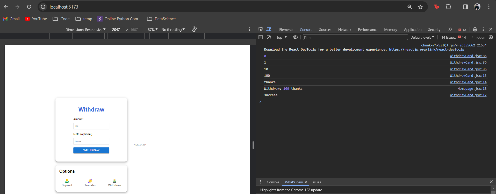
6. When you try to run the program, The result should similar like this
When you click the logo/button inside the options card the other card above it will change corresponding to what we click. That's because we use state where when we click each button it will change the state from initially deposit into other.
Try to insert something in the textfield in any transaction, what will happen?? nothing. That's because we only did the design so far but we can try to add console.log to check whether our component flow is work or not.

