RPG theme TODO App
Now we're gonna try to do some Lab about what we've learn so far. Please follow the given instruction until the end.
Objective:
- Understand the use of useState and Manage the state
- Understand concept of Component in React
- Understand to import and export concept in React
TodoApp Lab
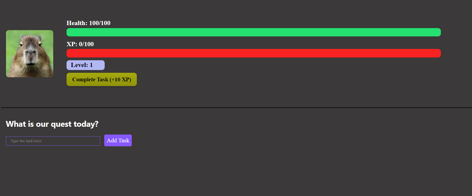
The Final result of the project should be like this
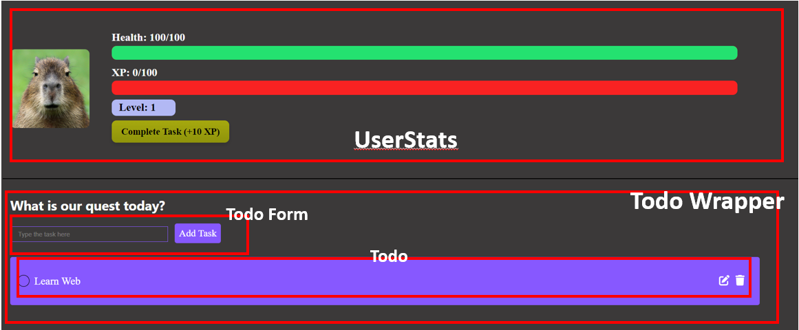
In the finished project is should have 4 different component
- UserStats
- Todo Wrapper
- TodoForm
- Todo
Setup The Project
1. Follow the previous lesson about how to create or start a react project or you can click here to navigate
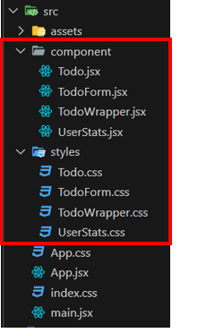
2. Inside the src folder create 2 folder, component and styles
- Component : Storing jsx files of each component
- Styles : storing css files of each component
After that create new files inside each folder, below is the files you need to create
component folder
- Todo.jsx
- TodoForm.jsx
- TodoWrapper.jsx
- UserStats.jsx
styles folder
- Todo.css
- TodoForm.css
- TodoWrapper.css
- UserStats.css
3. Change the code inside index.css with code below
:root {
  font-family: Inter, system-ui, Avenir, Helvetica, Arial, sans-serif;
  line-height: 1.5;
  font-weight: 400;
  background-color: #3B3939;
}
4. Change the code inside App.jsx with code below
import UserStats from "./component/UserStats"; // Importing UserStats component
import { TodoWrapper } from "./component/TodoWrapper"; // Importing TodoWrapper component
import './App.css'; // Importing CSS file for styling

const App = () => {
  return (
    <div className="Home">
      <div className="Container">
          <UserStats /> {/* Rendering UserStats component */}
          <TodoWrapper /> {/* Rendering TodoWrapper component */}
      </div>
    </div>
  );
}

export default App; // Exporting the App component as default
5. Change the code inside App.css with code below
.Container{
  align-items: center;
  background-color: #3B3939;
}

.profile-pic {
  width: 10%;
  height: 50%;
  margin-right: 2%;
  border-radius: 10px;
}

.stats {
display: flex;
align-items: center;
width: 100%;
margin-left: 1%;
}


.column {
display: flex;
flex-direction: column;
color: white;
font-size: 23px ;
width: 80%;
font-family: 'Sanchez', serif;
}

.stat {
margin-bottom: 10px;
position: relative;
margin-left: 1%;
color: #000;
font-weight: 700;
}

.bar {
height: 30px;
background-color: #F92222;
border-radius: 10px;
position: relative;
overflow: hidden;
display: flex;
align-items: center;
}

.health-bar {
height: 100%;
background-color: #24E170;
border-radius: 10px;
position: absolute;
top: 0;
left: 0;
display: flex;
align-items: center;
}

.xp-bar {
height: 100%;
background-color: #F4F90D;
border-radius: 10px;
position: absolute;
top: 0;
left: 0;
display: flex;
align-items: center;
}

.Info{
color: white;
}

.level-bar{
  background-color: #B2B8F4;
    padding-left: 15px;
    width: 120px;
    border-radius: 10px;
}
Currently when you run the project it doesn't show anything since we haven't create the component yet. In the next step we gonna start creating the components
Create UserStats component
Now let's create our UserStats component
1. Copy and paste the code below into UserStats.jsx component
import { useState } from "react"; // Importing the useState hook from React
import "../styles/UserStats.css"; // Importing the CSS file for styling

function UserStats() {
  // State variables to manage user stats
  const [level, setLevel] = useState(1); // State for the user's level, initialized to 1
  const [xp, setXp] = useState(0); // State for the user's XP (experience points), initialized to 0
  const [maxXp, setMaxXp] = useState(100); // State for the maximum XP required for leveling up, initialized to 100
  const [health] = useState(100); // State for the user's health, initialized to 100 (constant throughout the component's lifecycle)
  const [maxHealth] = useState(100); // State for the maximum health, initialized to 100 (constant throughout the component's lifecycle)

  // Function to add XP
  const addXp = (amount) => {
    const newXP = xp + amount; // Calculate new XP by adding the given amount to the current XP
    if (newXP >= maxXp) {
      // If new XP exceeds or equals the maximum XP
      const remainingXP = newXP - maxXp; // Calculate remaining XP after leveling up
      setLevel((prevLevel) => prevLevel + 1); // Increment the level by 1
      setXp(remainingXP); // Set XP with remaining XP after leveling up
      setMaxXp((prevMaxXp) => prevMaxXp * 2); // Double the maximum XP for the next level
    } else {
      setXp(newXP); // Update XP with the new value
    }
  };

  // Rendering UI elements
  return (
    <div className="User-Container">
      <div className="stats">
        {/* Displaying user profile picture */}
        <img
          src="https://www.rainforest-alliance.org/wp-content/uploads/2021/06/capybara-square-1.jpg.optimal.jpg"
          alt="Profile"
          className="profile-pic"
        />
        {/* Displaying user stats */}
        <div className="column">
          <div className="stat">
            {/* Displaying user's health */}
            <span className="Info">
              Health: {health}/{maxHealth}
            </span>
            {/* Displaying health bar */}
            <div className="bar">
              <div
                className="health-bar"
                style={{ width: `${(health / maxHealth) * 100}%` }} // Setting the width of health bar dynamically based on health percentage
              ></div>
            </div>
          </div>
          <div className="stat">
            {/* Displaying user's XP */}
            <span className="Info">XP: {xp}/{maxXp}</span>
            {/* Displaying XP bar */}
            <div className="bar">
              <div
                className="xp-bar"
                style={{ width: `${(xp / maxXp) * 100}%` }} // Setting the width of XP bar dynamically based on XP percentage
              ></div>
            </div>
          </div>
          <div className="stat">
            {/* Displaying user's level */}
            <div className="level-bar">
              Level: <span className="value">{level}</span>
            </div>
            {/* Button to add XP */}
            <button className="xp-button" onClick={() => addXp(10)}> {/* Adding 10 XP when the button is clicked */}
              Complete Task (+10 XP)
            </button>
          </div>
        </div>
      </div>
    </div>
  );
}

export default UserStats; // Exporting the UserStats component as default
Here's an additional explanation regarding how the useState hook works in the UserStats component:
-
Initialization: When the component is first rendered, the
useStatehook initializes the state variables:level: It holds the user's current level and is initialized to1.xp: It stores the user's current XP (experience points) and is initialized to0.maxXp: It represents the maximum XP required for leveling up and starts with100.health: This state is initialized to100and remains constant throughout the component's lifecycle. It represents the user's current health.maxHealth: This state is initialized to100and remains constant throughout the component's lifecycle. It represents the maximum health a user can have.
-
Updating State: The
addXpfunction is used to add XP to the user's current XP. It takes an amount as a parameter, calculates the new XP by adding the amount to the current XP, and updates the state accordingly. If the new XP exceeds or equals the maximum XP (maxXp), it triggers a level up. Otherwise, it simply updates the XP. -
Leveling Up: If the new XP exceeds or equals the maximum XP (
maxXp), it indicates that the user has leveled up. In this case:- The function increments the
levelstate by1. - It updates the
xpstate with the remaining XP after leveling up. - It doubles the
maxXpfor the next level.
- The function increments the
-
Rendering: The UI renders the user's profile picture, along with their stats such as health, XP, and level. It also displays progress bars for health and XP, reflecting the current status compared to their maximum values.
-
Interactivity: The component includes a button labeled "Complete Task (+10 XP)" that, when clicked, adds
10XP to the user's current XP using theaddXpfunction.
2. Copy and paste the code below into UserStats.css file
.User-Container{
display: flex;
flex-direction: flex-start;
align-items: center;
height: 380px;
background-color: #3B3939;
border-bottom: 2px solid #000000;
}
.profile-pic {
width: 20%;
height: 50%;
margin-right: 2%;
border-radius: 10px;
}
.stats {
display: flex;
align-items: center;
width: 100%;
margin-left: 1%;
}
.column {
display: flex;
flex-direction: column;
color: white;
font-size: 2rem ;
width: 80%;
font-family: 'Sanchez', serif;
}
.stat {
margin-bottom: 10px;
position: relative;
margin-left: 1%;
color: #000;
font-weight: 700;
}
.bar {
height: 1rem;
background-color: #F92222;
border-radius: 10px;
position: relative;
overflow: hidden;
display: flex;
align-items: center;
}
.health-bar {
height: 100%;
background-color: #24E170;
border-radius: 10px;
position: absolute;
top: 0;
left: 0;
display: flex;
align-items: center;
}
.xp-bar {
height: 100%;
background-color: #F4F90D;
border-radius: 10px;
position: absolute;
top: 0;
left: 0;
display: flex;
align-items: center;
}
.Info{
color: white;
}
.level-bar{
background-color: #B2B8F4;
padding-left: 15px;
width: 2rem;
border-radius: 10px;
}
.xp-button{
background: linear-gradient(to bottom, #a6a90e 0%, #8f930b 100%);
color: rgb(0, 0, 0);
border: none;
border-radius: 10px;
padding: 12px 20px;
font-size: 20px;
font-weight: bold;
margin-top: 10px;
cursor: pointer;
font-family: 'Sanchez', serif;
box-shadow: 0px 4px 8px rgba(0, 0, 0, 0.15);
transition: background-color 0.3s ease;
}
.xp-button:hover{
background-color: #ffffff;
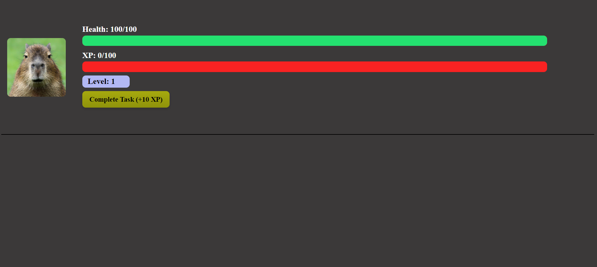
}3. If you run the project you will not see the result yet because we don't have the todo wrapper component. In case you want to see your result what you can do is comment on todo wrapper in App.jsx like in this code below
import UserStats from "./component/UserStats";
// import { TodoWrapper } from "./component/TodoWrapper";
import './App.css';

const App = () => {
  return (
    <div className="Home">
      <div className="Container">
          <UserStats />
          {/* <TodoWrapper /> */}
      </div>
    </div>
    );
}

export default App;
Your result when you run it should appear like this
Creating To Do list
Create To-Do Wrapper Component
Now we're gonna start to create the todo list, but before that I need you to install some dependencies
1. Type this command inside the project
npm install @fortawesome/react-fontawesome @fortawesome/free-solid-svg-icons uuid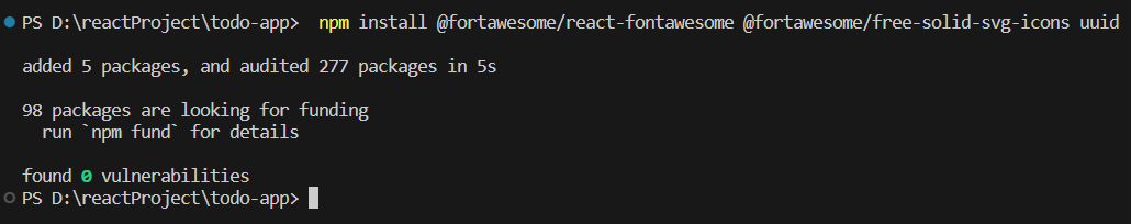
So we installed 3 different dependencies, below is the function of each dependencies
1. `@fortawesome/react-fontawesome`: React wrapper for Font Awesome icons.
2. `@fortawesome/free-solid-svg-icons`: Package containing free solid icons for Font Awesome.
3. `uuid`: Package for generating unique identifiers (UUIDs) in JavaScript.
2. Copy and paste this code below inside TodoWrapper.jsx component
import  { useState } from "react";
import { Todo } from "./Todo"; // Importing Todo component
import { TodoForm } from "./TodoForm"; // Importing TodoForm component
import { v4 as uuidv4 } from "uuid"; // Importing uuid library
import "../styles/TodoWrapper.css"; // Importing CSS file for styling

export const TodoWrapper = () => {
  // State to hold the list of todos
  const [todos, setTodos] = useState([]);

  // Function to add a new todo
  const addTodo = (todo) => {
    setTodos([
      ...todos,
      { id: uuidv4(), task: todo, completed: false }, // Adding new todo with unique id
    ]);
  }

  // Function to delete a todo
  const deleteTodo = (id) => {
    setTodos(todos.filter((todo) => todo.id !== id)); // Filtering out the todo with the specified id
  }

  // Function to toggle the completion status of a todo
  const toggleComplete = (id) => {
    setTodos(
      todos.map((todo) =>
        todo.id === id ? { ...todo, completed: !todo.completed } : todo // Toggling completed status of the todo with the specified id
      )
    );
  }

  return (
    <div className="TodoWrapper">
      <h1 style={{ color: '#fff', marginBottom: '0.5rem', fontSize: '1.75rem'}}>What is our quest today?</h1>
      <TodoForm addTodo={addTodo} /> {/* TodoForm component for adding new todos */}
      {/* Displaying todos */}
      {todos.map((todo) => (
        <Todo
          key={todo.id} // Unique key for each todo
          task={todo}
          deleteTodo={deleteTodo} // Function to delete todo
          toggleComplete={toggleComplete} // Function to toggle completion status
        />
      ))}
    </div>
  );
};
How we pass the props in above component?
-
<TodoForm addTodo={addTodo} />:- This JSX element represents the rendering of the
TodoFormcomponent. - The
addTodofunction is passed to theTodoFormcomponent as a prop namedaddTodo. - The
addTodofunction is used within theTodoFormcomponent to add a new todo item to the list of todos. By passing it as a prop, theTodoFormcomponent gains access to this functionality and can invoke theaddTodofunction when needed.
- This JSX element represents the rendering of the
-
{todos.map((todo) => (:- This JSX expression represents the rendering of multiple
Todocomponents based on the items in thetodosarray. - The
todos.map()function iterates over each todo item in thetodosarray. - For each todo item, a
Todocomponent is rendered. -
<Todo key={todo.id} // Unique key for each todo task={todo} deleteTodo={deleteTodo} // Function to delete todo toggleComplete={toggleComplete} // Function to toggle completion status /> - Inside the
map()function, a uniquekeyprop is assigned to eachTodocomponent using thetodo.id. This is important for React to efficiently update the list of components and maintain proper component state. - For each
Todocomponent, the following props are passed:task: This prop contains the entire todo object, allowing theTodocomponent to access the todo's properties such asid,task, andcompleted.deleteTodo: This prop is a reference to thedeleteTodofunction defined in theTodoWrappercomponent. It allows theTodocomponent to call thedeleteTodofunction when needed to delete the corresponding todo item.toggleComplete: Similar todeleteTodo, this prop is a reference to thetoggleCompletefunction defined in theTodoWrappercomponent. It allows theTodocomponent to call thetoggleCompletefunction to toggle the completion status of the corresponding todo item.
- This JSX expression represents the rendering of multiple
The explanation below is not mandatory to understand right now, but good to know and might be useful in the future
let's break down each function in detail:
-
addTodo: This function is responsible for adding a new todo item to the list of todos. It takes a
todoparameter, which represents the task to be added. Inside the function, thesetTodosfunction is called with the updated todo list. It uses the spread operator (...todos) to create a new array containing all existing todos along with the new todo. The new todo object is constructed with a uniqueidgenerated usinguuidv4(), thetaskprovided as input, and acompletedflag initialized tofalse. This new todo is then appended to the existing list of todos. -
deleteTodo: This function is responsible for deleting a todo item from the list based on its
id. It takes anidparameter, representing the unique identifier of the todo to be deleted. Inside the function, thesetTodosfunction is called with the updated todo list. It filters out the todo with the specifiedidby using thefiltermethod on thetodosarray. Thefiltermethod creates a new array that includes only the elements for which the provided function returnstrue, effectively removing the todo with the specifiedid. -
toggleComplete: This function is responsible for toggling the completion status of a todo item based on its
id. It takes anidparameter, representing the unique identifier of the todo whose completion status needs to be toggled. Inside the function, thesetTodosfunction is called with the updated todo list. It uses themapmethod on thetodosarray to create a new array where each todo's completion status is updated. If the todo'sidmatches the providedid, itscompletedstatus is toggled (i.e., flipped fromtruetofalse, or vice versa). Otherwise, the todo remains unchanged. This ensures that only the completion status of the todo with the specifiedidis modified, while all other todos remain unaffected.
3. Copy and paste this code below inside TodoWrapper.css file
.TodoWrapper {
    background: #3B3939;
    padding: 1rem;
    border-radius: 3px;
    height: 100%;
    width: 93vw;
    margin-left: 0;
  }
Create To-Do Form Component
1. Copy and paste the code below inside TodoForm.jsx component
import { useState } from 'react'; // Importing the useState hook from React
import '../styles/TodoForm.css'; // Importing the CSS file for styling

export const TodoForm = ({ addTodo }) => {
  // State to manage the input value of the todo
  const [value, setValue] = useState('');

  // Function to handle form submission
  const handleSubmit = (e) => {
    e.preventDefault(); // Preventing default form submission behavior
    if (value) {
      // If the input value is not empty
      addTodo(value); // Calling the addTodo function passed as prop from the parent component with the input value as parameter
      setValue(''); // Clearing the input value after submission
    }
  };

  // Rendering the todo form
  return (
    <form onSubmit={handleSubmit} className="TodoForm"> {/* Form element with onSubmit event handler */}
      <input
        type="text"
        value={value} // Binding the input value to the state variable 'value'
        onChange={(e) => setValue(e.target.value)} // Handling onChange event to update the state with the input value
        className="todo-input"
        placeholder='Type the task here' // Placeholder text for input field
      />
      <button type="submit" className='todo-btn'>Add Task</button> {/* Button to submit the form */}
    </form>
  );
};
-
useState Hook: The
useStatehook is used to define a state variable namedvalue, which holds the input value of the todo. ThesetValuefunction is used to update the value of this state variable. -
handleSubmit Function: This function is called when the form is submitted. It prevents the default form submission behavior using
e.preventDefault(). If the input value (value) is not empty, it calls theaddTodofunction (passed as a prop from the parent component) with the input value as a parameter. After adding the todo, it clears the input field by setting thevaluestate to an empty string. -
Rendering: The JSX code renders a form with an input field for entering the todo task and a button for submitting the form. The input field's value is bound to the
valuestate, and theonChangeevent updates the state whenever the input value changes. When the form is submitted, thehandleSubmitfunction is called.
2. Copy and paste the code below inside TodoForm.css file
.TodoForm {
    width: 80vw;
  }

  .todo-input {
    outline: none;
    background: none;
    border: 1px solid #8758ff;
    padding: 0.5rem 1rem;
    margin-top: 1rem;
    margin-bottom: 2rem;
    width: 300px;
    color: #fff;
  }

  .todo-input::placeholder {
    color: #ffffff4d;
  }

  .todo-btn {
    background: #8758ff;
    color: #fff;
    border: none;
    padding: 0.55rem;
    cursor: pointer;
    font-size: 1.3rem;
    font-family: 'Sanchez', serif;
    margin-left: 15px;
    border-radius: 5px;
  }
Create To-Do Component
1. Copy and paste the code below inside Todo.jsx component
import { FontAwesomeIcon } from '@fortawesome/react-fontawesome'; // Importing FontAwesomeIcon from the react-fontawesome library
import { faPenToSquare } from '@fortawesome/free-solid-svg-icons'; // Importing the pen icon from FontAwesome
import { faTrash } from '@fortawesome/free-solid-svg-icons'; // Importing the trash icon from FontAwesome
import '../styles/Todo.css'; // Importing the CSS file for styling

export const Todo = ({ task, deleteTodo, editTodo, toggleComplete }) => {
  // Styling for the completion button
  const buttonStyle = {
    borderRadius: '50%',
    width: '25px',
    height: '25px',
    backgroundColor: task.completed ? 'green' : 'transparent',
    border: '1px solid black',
    cursor: 'pointer',
  };

  // Rendering the Todo component
  return (
    <div className="Todo"> {/* Container for the todo item */}
      <div style={{ display: 'flex', alignItems: 'center' }}> {/* Container for the todo text and completion button */}
        <button
          style={buttonStyle} // Applying the completion button style
          onClick={() => toggleComplete(task.id)} // Calling toggleComplete function when the completion button is clicked
        ></button> {/* Empty button for completion status */}
        <p
          className={`${task.completed ? 'completed' : ''}`} // Applying completed class if the task is completed
          style={{ marginLeft: '10px', flex: 1 }} // Styling for the todo text
        >
          {task.task} {/* Displaying the todo task */}
        </p>
      </div>
      <div> {/* Container for the edit and delete icons */}
        {/* Edit icon */}
        <FontAwesomeIcon icon={faPenToSquare} onClick={() => editTodo(task.id)} /> {/* Calling editTodo function when the edit icon is clicked */}
        {/* Delete icon */}
        <FontAwesomeIcon icon={faTrash} onClick={() => deleteTodo(task.id)} /> {/* Calling deleteTodo function when the delete icon is clicked */}
      </div>
    </div>
  );
};
-
FontAwesomeIcon and Icons: FontAwesomeIcon is imported from the
@fortawesome/react-fontawesomelibrary to render icons in the Todo component. Two icons are imported usingfaPenToSquareandfaTrashfrom the@fortawesome/free-solid-svg-iconslibrary. -
Rendering: The Todo component renders a div with the class name "Todo", containing two sections: one for the todo text and completion button, and another for the edit and delete icons.
-
Completion Button: A button with dynamic styling is rendered to represent the completion status of the todo task. The button's background color is green if the task is completed, and transparent otherwise. The toggleComplete function is called when this button is clicked to toggle the completion status of the todo task.
-
Todo Text: The todo text is rendered inside a paragraph element. If the task is completed, the "completed" class is applied to the paragraph to style it differently.
-
Edit and Delete Icons: FontAwesome icons for edit and delete actions are rendered. The editTodo function is called when the edit icon is clicked, and the deleteTodo function is called when the delete icon is clicked.
2. Copy and paste the code below inside Todo.css component
.Todo {
    display: flex;
    justify-content: space-between;
    align-items: center;
    background: #8758ff;
    color: #fff;
    padding: 0.75rem 1rem;
    border-radius: 5px;
    margin-bottom: 1rem;
    cursor: pointer;
    font-size: 1.4rem;
    font-family: 'Sanchez', serif;
  }

  .fa-trash {
    margin-left: 0.75rem;
    margin-right: 1rem;
  }

  .completed {
    color: #c5aeff;
    text-decoration: line-through;
  }
Run the project
Since you already create all of the component, you can remove the comment from the App.jsx (if you comment todo wrapper before)
import UserStats from "./component/UserStats";
import { TodoWrapper } from "./component/TodoWrapper";
import './App.css';

const App = () => {
  return (
    <div className="Home">
      <div className="Container">
          <UserStats />
          <TodoWrapper />
      </div>
    </div>
    );
}

export default App;
Final Result
Yeayyy You already create a simple RPG theme to-do App !!!! :)

Challenges?
Do you want to challenge yourself? Try to do task below. Its not mandatory but can be fun :D
- Try to change the image into any image inside your folder , not from link address. (How to import images?) quite easy
- Currently we can't edit the list that we've made. Try to add an edit function for the todo list to edit existing list by clicking this logo beside the trash can logo


No comments to display
No comments to display