Variety of the Input in Form
What Are Controlled Components?
In React, we like to keep everything in check. A "controlled component" means React is in control of what's happening in the form. It helps us manage things more easily.
Multiple kinds of input
Let's make our form more interesting! We can add variety of input type to our form to make our user experience better.
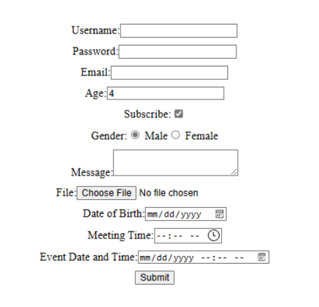
Here are some commonly used input types in React forms:
- Text Input (
<input type="text">):- Used for general text input.
- Suitable for short to medium-length text, such as names and addresses.
- Password Input (
<input type="password">):- Designed for securely capturing passwords.
- Characters are typically masked for privacy.
- Email Input (
<input type="email">):- Specifically designed for capturing email addresses.
- Includes built-in browser validation for email format.
- Number Input (
<input type="number">):- Used for numeric input, such as age or quantity.
- May include up/down arrows for easy value adjustment.
- Checkbox (
<input type="checkbox">):- Allows users to select one or more options from a list.
- Suitable for binary choices or multiple selections.
- Radio (
<input type="radio">):- Used when users need to select a single option from a list.
- Grouped together using the same
nameattribute.
- Textarea (
<textarea>):- Used for multi-line text input, suitable for longer messages or comments.
- File Input (
<input type="file">):- Enables users to upload files.
- Typically used for images, documents, or other file types.
- Date Input (
<input type="date">), Time Input (<input type="time">), and DateTime Input (<input type="datetime-local">):- Used for capturing dates, times, or both.
Here's the example of variety form type
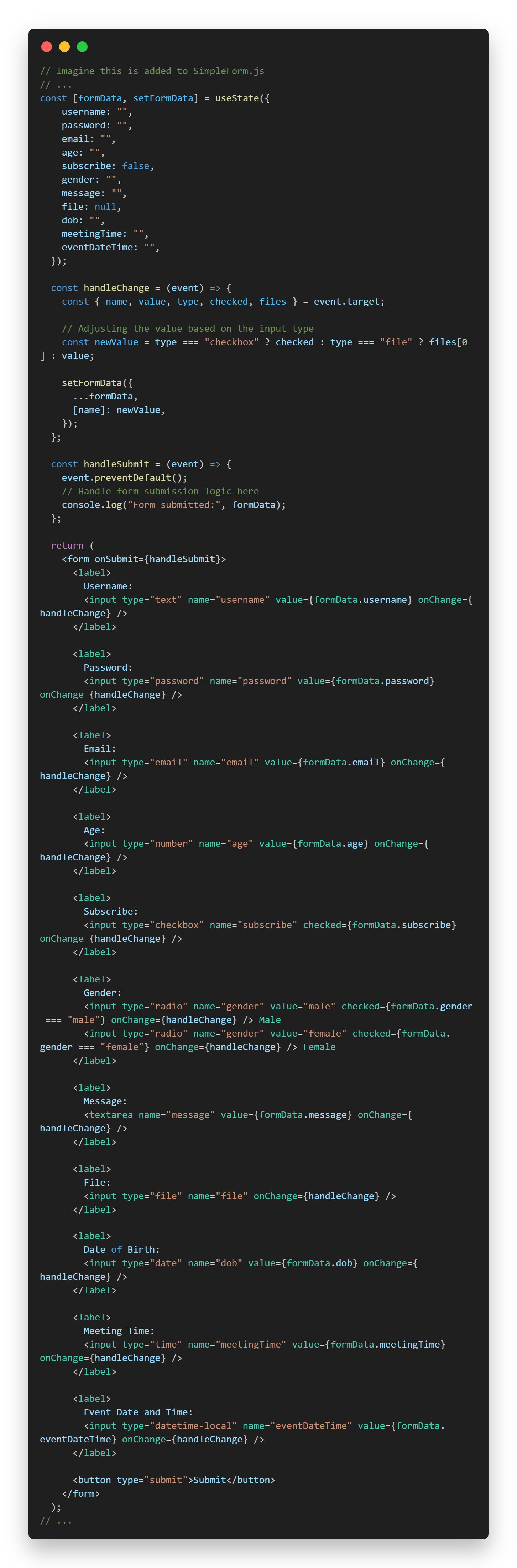
You can implement it likes usual by make the state to store data and have a handle function to handle events likes form that you've seen in previous page.
No comments to display
No comments to display